Oblivion
$10
Categories:GamesTemplate builder:yes [?]
Number of columns:2
Website width:adaptive
File size:2.01Mb, zip
Views:11814
Purchases:46
Template author:PRO
Last time updated:09.04.2019
Screenshots:
Like the template? Share to your friends:
Description:
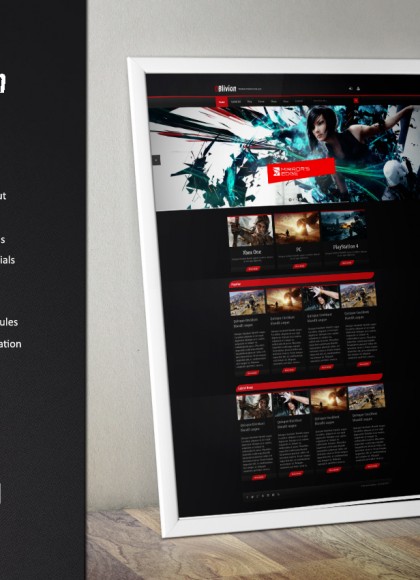
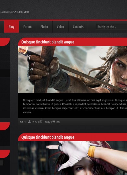
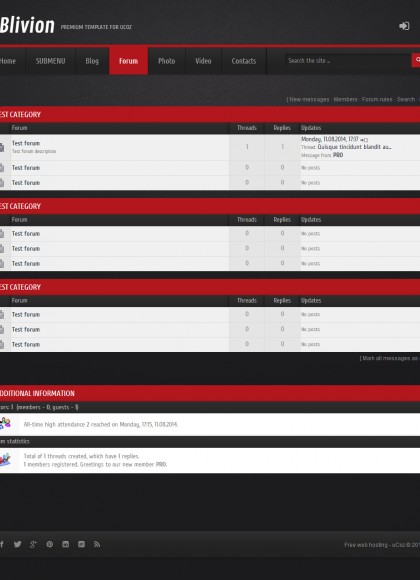
OBlivion - stylish and adaptive template for websites running on the system uCoz. Despite the fact that it is positioned primarily as a template for gaming and movie themes, can be used to design websites other topics.
Key features include:
Key features include:
- unique design;
- adaptive design
- adaptive slider with support for graphics, video, text and links;
- cross-browser layout;
- HTML5 markup;
- integration of CSS3;
- Unlimited number of color options;
- Advanced Configuration of the main page to output it to the list of materials with the help of the informer;
- Font Awesome - more than 300 icons;
- Custom layout albums;
- Non-standard design materials;
- support for all modules;
- detailed documentation for installation and configuration.
Changelog
Comments:


what this means ( Copy view photos in a folder Settings; View Images ) , because when upload a photo cant see the menu only half
https://postimg.org/image/gptlv32ef/
http://spiderfilmes.ucoz.com/
but this code in css: .view-first img {
width: 100%;
}
The website is http://cypris.ucoz.com If that helps
add to CSS:
width: 219px !important;
}
div.grid_5:nth-child(5) > a:nth-child(1) > img:nth-child(1) {
width: 219px !important;
}
Thanks!
this code:
div.grid_5:nth-child(5) {
width: 219px !important;
}
div.grid_5:nth-child(5) > a:nth-child(1) > img:nth-child(1) {
width: 219px !important;
}
Thanks again!
For the first and second code informer copy folder
Settings-> Informery-> Informer (He is responsible for the removal of material from the module to the main blog).
did you try it?
<a href="$ENTRY_URL$"> <img src="$IMG_URL1$" width="300" height="157"></a>
<span><a href="$ENTRY_URL$">$TITLE$</a></span>
<p>$MESSAGE$</p>
<div class="buttoncenter"><button onclick="document.location='$ENTRY_URL$'">Read more</button></div>
</div>
can I see your website? (url)
Tip for everyone: When you install the template, make sure all wanted modules are enabled PRE-INSTALLATION or you will have to install again for it to design those modules. Took me a while to realize this (probably shouldn't have...) but now you don't have to deal with that.
Cons: menu opens behind the carousel
Creator please fix the menu overlap, in full and mobile version, If you press on the submenu you will see that it pops out behind the carousel. Also is it possible to make the scrolling menu just like in the Apoffiss Template? Please email me when you will fix it and i will buy it. olekbyc@gmail.com
[ Registration | Login ]