Template builder: [?]
Number of columns:2
Website width:Responsive
File size:3.65Mb, zip
Views:78375
Purchases:23
Template author:AGStudio
Last time updated:05.04.2019
LeBoutique is an excellent template, which is suitable for creating an online store of women's clothing or a wedding salon. It has additional elements, such as quick search, a list of product's options and others.
Features:
- Fully Responsive;
- Clean, Modern & Beautiful Design;
- Working Contact Form;
- Google Fonts Used;
- 1000+ Font Icon Included;
- Well Documented;
- Quick search for online shop;
- Product data are displayed through the list, instead of the selector;
- Structured data markup of contact details and some modules (more on http://schema.org/)
- 11 informers;
- New style for all modules;
- Form creating via Feedburner for RSS;
- 2 galleries style for "News" and "Blog" modules;
- Go to the next and previous materials;
- Related entries with images;
- Responsive slider on the Home page;
- Parallax;
- and many other things.
The most interesting
We pulled out all the delights of the template in these blocks, and you only have to click on them.


Are you interested in what you saw? If you want to feel all this yourself, visit the demo demo site.
How to install the template
The template is set up in several simple steps. To do this, you need to go to the CP of your site, copy the contents of one folder (from the archive) to the root of the site using a file manager or any FTP client. After that, restore the backup copy. After this simple procedure, you only need to configure the informers and enjoy the result.

Simple and understandable instruction will help you with this, with a visual demonstration of the installation, configuration and use of some modules of this template.

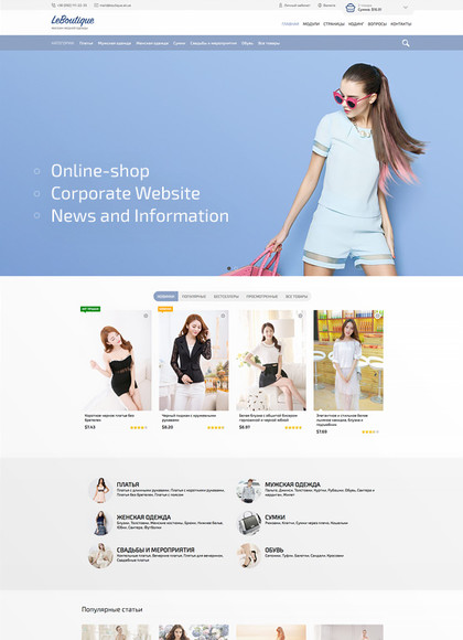
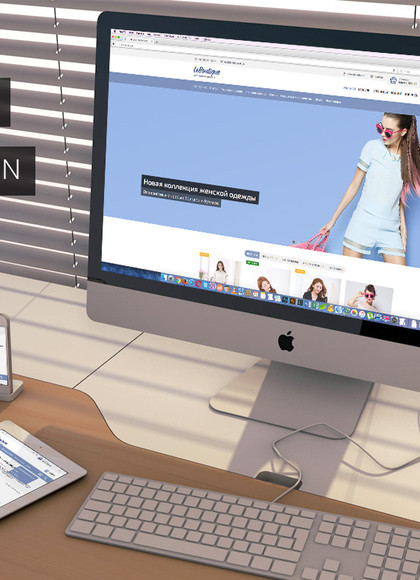
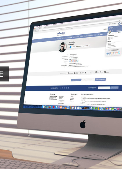
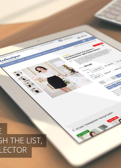
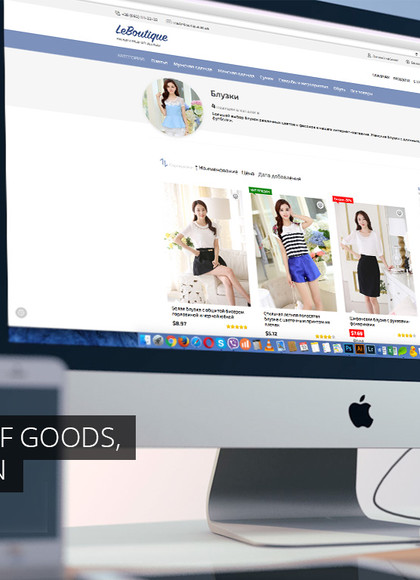
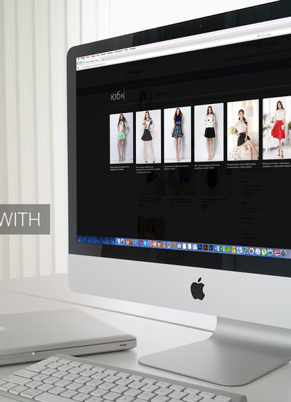
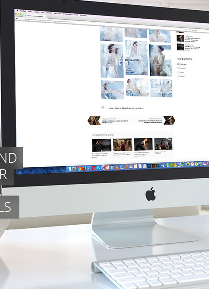
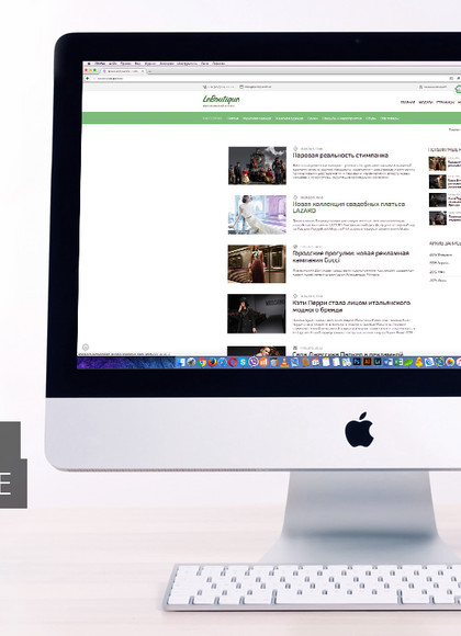
The design is very nice (I had to change it a little because i do't use it for a fashion boutique)
The problem is that the template is not complete... here and there lines of codes are missing, and I lost a lot of time to complete it it...
One question guys, is it possible to put the author details at the top while viewing the forum post from mobile phones? The current setting is such that the post author profile is shown on the left and it takes a whole lot of space and so the content of the forum post is shown in only the few spaces and not covering the whole screen space.
otherwise i have no complaints!!!
Here's my site made with this theme https://tangkhulonline.com/
Design, functionality, easy to navigate, and fast loading template! <3
[ Registration | Login ]